Casa Sheila – part 2: creative rebrand
Capstone | Branding | UX & UI
Brief
Create a cohesive brand without limitations of existing branding for marketing campaigns and a website redesign
Role & Skills
Team
Project Breakdown
Problem
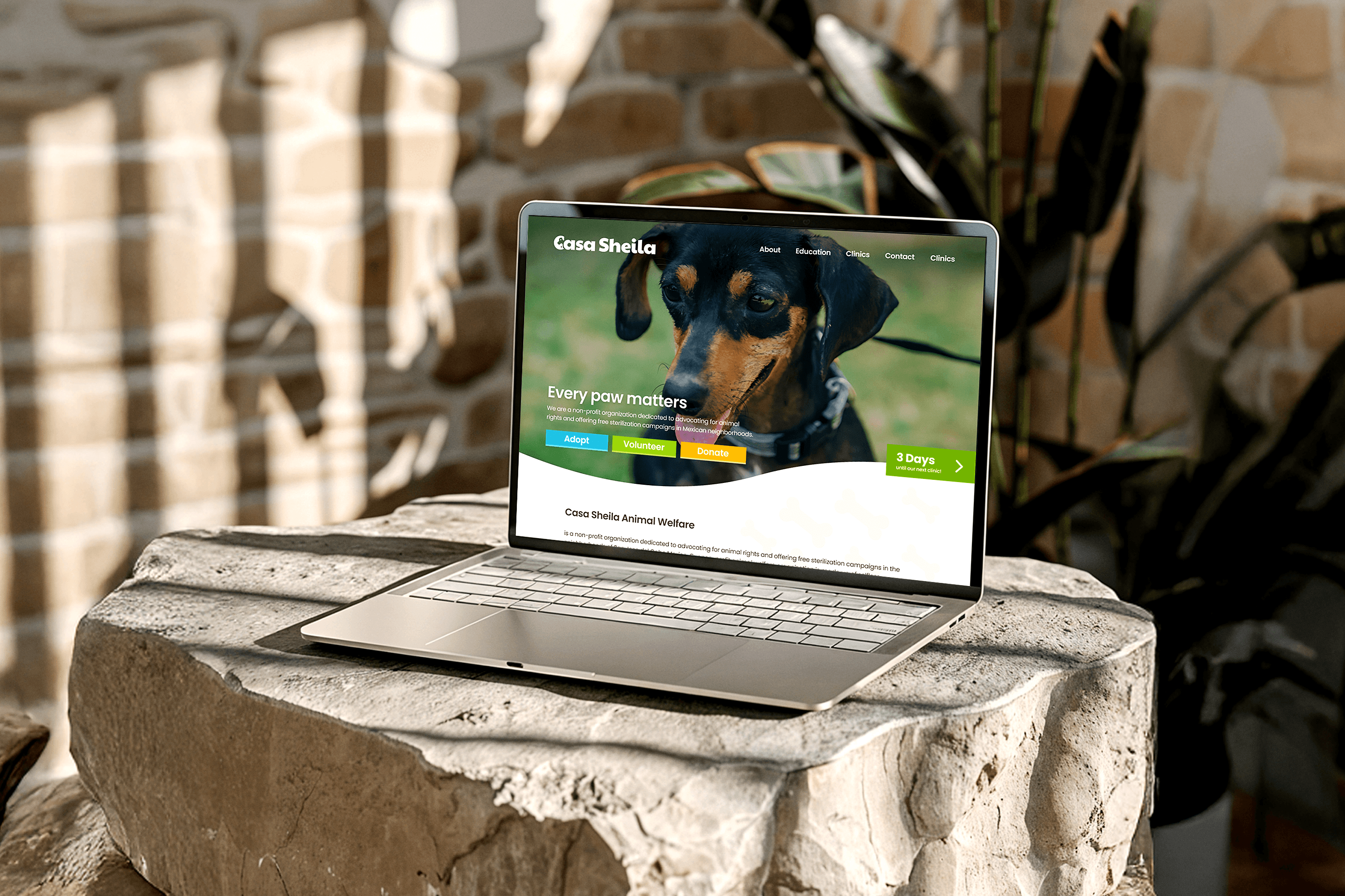
The current organization's logo is overwhelming and struggles to create a "welcoming" feel with consistent branding.
Goal
Redesign a new logo and brand that is 'fun', cohesive, and action-oriented.
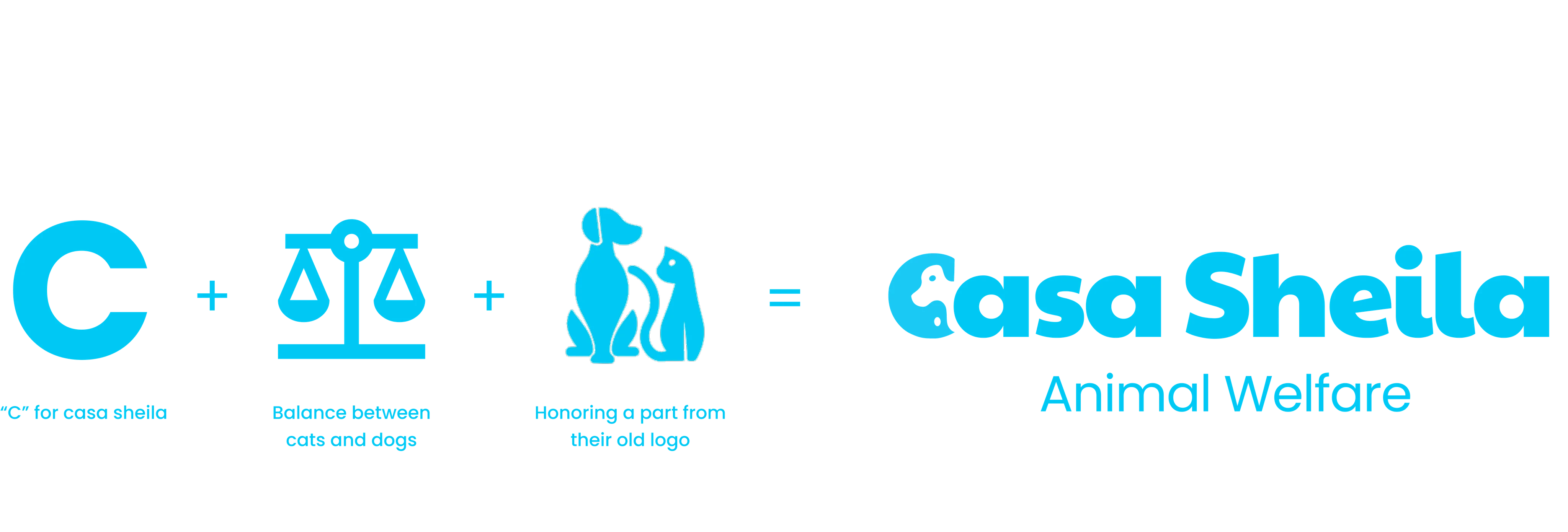
Complete rebrand
Building upon the first part of the client rebrand project that utilizes the given logo to create a rebrand, we wanted to start from scratch and explore a complete rebrand. This included the logo and a brand-new color palette that will be used to create a brand identity for a marketing campaign.
Interactive throughout
Brand Identity
Poster Advertisements
Street poster advertisement to be displayed in San José, del Cabo to bring awareness to the organization's identity and actionable steps


Social Media
Rebuilding the social media pages to be more consistent with the new brand. Helping users understand the cause by answering any commonly asked questions and displaying pets available for adoption.
Clothing
Shirts create a sense of community for those involved in the cause. They can be worn by volunteers at clinics to help the community identify the helpers.


Brochures
A resources for the community and those interested to learn more about the organization, the cause, and how they can help.
Conclusion
Consistency in creative branding
After doing the work in Part 1: Client Rebrand, being able to creatively design a brand, removing the expectations and limitations that came with using the current client logo, this project, part 2, was a lot of fun to complete. Connecting the actionable steps with brand colors, users have an easier time engage in the organizations programs. These new colors allowed us to better organize the home page and the overall branding. The Call to Action buttons are now clearer and likely bring more site engagement.
Reflection
Completing the second rebrand for this organization without the client's input and limitations makes me realize the potential that any organization has to improve its branding and marketing, especially in the non-profit industry. With a stronger brand identity that aligns with organization goals, brings desired results much faster and consistently.