National Parks Service
Product ReDesign | UX & UI
Brief
Transform the NPS app into an intuitive, action-oriented tool that supports explorers before and during their adventures. We wanted users to feel both inspired to explore and equipped to do so safely.
Role
Team
Overview
Problem
Goal
Transform the NPS app into an intuitive, action-oriented tool that supports explorers before and during their adventures. We wanted users to feel both inspired to explore and equipped to do so safely.
Design Process
Initial Analysis
Breaking down the app and competitors such as, National Parks Pocket App, Parkwolf, and National parks Trail Guide, we found pros and cons or each.
The existing NPS app and competitors suffered from:
Poor content organization
Overwhelming volume of information
Frustrating UI patterns (endless scrolling, unnecessary pop-ups)
Lack of clear planning tools and real-time safety features
Analysis Conclusion
Users needed a way to quickly locate relevant information, feel prepared for trips, and access real-time support while on the trails.
How might we help explorers feel confident and safe while experiencing the national parks?
Priority Circles
With an app with so many features, we had to identity our main goals in our redesign


UX Triangle
We broke down the user experience and had that be our foundation during the design process
Information Architecture
Focused on our main features, we were able to breakdown each element that make up the experience

Applying the Designs
Mood Board
We drew inspiration from the colors of the environment that felt warm, welcoming, and adventurous

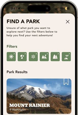
Personalized Park Finder Filtering System
Ability to select favored conditions for trip visit - Weather, terrain, views, trail levels
Users can plan and save park visits, see safety alerts.
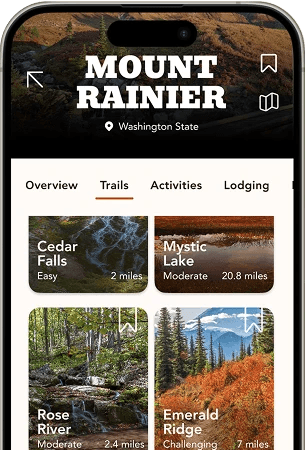
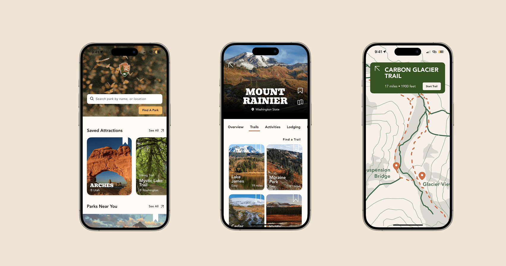
Organized & Detailed User Experience
A central Park hub that prioritizes action: explore parks, trail conditions, weather, education, and navigate—all from one screen.
Trail Information to build confidence prior to exploring - views, level, condition, map view
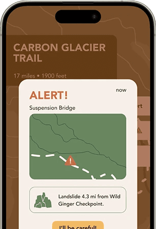
Built-In Trail Safety
Real-time trail alerts - Weather, Terrain, Animal, etc.
Know your trail community - Live chat to communicate with those on the trail with you if you ever need help.
Conclusion
Call outs + Next Steps
With further space and time, we would look to explore the user experience post completion of an adventure, possibility that there may not be service for the community chat while on the trail, and how might the community be implemented in other park features?
Reflection
This project taught me the importance of prioritizing user experience and emotion —especially confidence and clarity— with specific user journey in mind when designing utility-heavy apps. By shifting from an information dump to a purpose-driven journey, we empowered people to explore nature with ease, safety, and excitement.